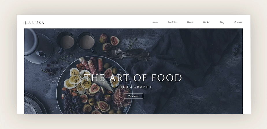
Best Practices for Your Website Header Design

Mapping out your own website design often requires you to call on experts who live and breathe the stuff for guidance (psst, that’s us). Take a website header design, for example. Sure, you’ve heard of a header and you’ve seen it used repeatedly on other websites - but do you really know how much potential lies within this tiny piece of website real estate?
Designing the perfect header is a more bespoke process than you might think. As you create your website, keep in mind the header is the first thing visitors will encounter when they land on your homepage. Like all aspects of your site, it needs to reflect your brand, and involves equal amounts of strategic and creative thinking.
Whether you're starting from scratch or giving your current site a makeover, we’ve got a compilation of the best practices for crafting a header design that’s as smart and attractive as the rest of your website.
What is a website header?
Like the name implies, a header refers to the upper section of a website page. It’s a strip of content usually pinned directly to the top, so it shows up consistently throughout every page of your site.
The main purpose of a header is to give visitors a clear outline of the basic content on your website, and invite them to view more. Just as important is its function as a navigational tool. As visitors make their way from one page to the next, a website header can present them with clear direction.
A header sets the tone for the rest of a website, and it's no surprise that we see more website designers enthusiastically emphasizing its aesthetic value. The result is a shift and variation in the way websites headers continue to be designed, what they can include, and how they appear on a website.
What should you include in a website header?
Website headers are an important part of your website’s design, but they don’t take up much space. It’s up to you to decide what elements to include in that small (albeit valuable) area.
You want your header design to enhance visitors' interaction with your site, so when you choose what to include in it, consider highlighting the parts of your website that you want to stand out most. This space should invite users to peruse through that content.
While you don’t have to add all of these to your own website’s header design, here are the most popular elements generally included in a website header:
Business name
Put simply, including your business name is a good way to help visitors acknowledge that they’ve arrived at the correct location. As far as extra value, the presence of your business name at the top of your website can only strengthen your brand identity.
By the way, we use the term business name loosely here - if you’re creating a blog or building an online portfolio, don’t shy away from inserting your own name or initials into the header. In case you don't already have one, you can always use this business name generator to help you get started.

Logo
When you create a logo, this is a central part of having a small business or personal brand. It doesn’t matter what industry you belong to, your logo is the star of all your marketing assets. Ergo, adding your logo to the header of your website is another great way to strengthen your brand identity. Plus, it’s a good opportunity to show it off.
If you’re wondering where exactly to place your logo, you should know that there’s no standard practice. Many website designers will center it, and plenty will put it off to the side. An interesting study by Nielsen Norman group found that users are more likely to remember a brand when they see their logo on the left-hand side of a website’s header, so that might weigh in on your decision - but don’t put that before your own personal satisfaction.
Pro tip: If you’re worried that your logo is too big for your small header space, you might want to create a variable logo, which is a smaller, simpler version of the real thing.
Navigation menu
A website header is considered a default location to place your website’s navigation menu. This means creating a list of your website’s items (such as an About Us page) and linking each to its designated location. Including a menu in your header is indeed a logical decision, since it can’t be missed. This provides visitors with straightforward website navigation, securing a positive user experience.
Shopping cart
When designing a website, a lot of your decisions should involve guiding the user towards where they need to be before they even start looking. If your website includes an online store, adding a shopping cart to the website header will simplify and improve your shopper’s checkout process. The ubiquitous basket icon serves as a recognizable checkout location as users continue to browse and add items to their carts. Most importantly, they won’t get distracted from their (and your) final goal: fulfilling their orders and paying with ease.

Search bar
Adding a search bar to your header can be a great gift for visitors. It gives them the option to perform a search on your site, displaying a clear list of items connected to the query. This is an especially clever tool to add to a blog, as it helps users find posts related to the topics they are most interested in.
If you’re going to add an element like this to your website, it better be on your website’s header. Visitors will never miss it, and they’ll probably appreciate easy access to the search bar at the top of your page.
Login
If you create a membership website, this usually requires users to log in, since its purpose is to protect exclusive information from the public. Whether members pay for a subscription or not, you’ll have to give them credentials in order to access your website’s members-only material. Therefore, you’ve got to have a clear place for them to login, and the most obvious location for indicating a login form is at the header of your homepage where everyone can find it.
Social media links
Who doesn’t want more followers on social media? It’s common practice to add social icons to a website. Linking these to your preferred channels will make it simple to turn website visitors into followers and likes.
Usually, social links are included in a website's header or footer design. Placing these links to the top of your website definitely means users will see them faster. However, if space is an issue in your header’s design - don’t stress about fitting these in here. Most users are aware that social media icons appear on a website’s footer, and it’s likely they’ll check there too.

Languages
So, your website speaks multiple languages? That’s impressive. Seriously, building a multilingual website is an ambitious endeavor - but if you’ve got the resources, this kind of operation will significantly grow your audience and enable you to create localized content.
After the translations are complete and your content is uploaded, your next task is to make sure international visitors can arrive to the language of their choice. Adding a language toggle menu to your header design is the best way to indicate more language options.
Best practices for website header design
These days, don’t let the standard website header design fool you. While the old faithful horizontal navigation menu serves its purpose well, feel free to also think outside the horizontal box. Designing a website header still involves plenty of thought and effort, especially since it involves finding clever ways to include information into a limited space.
Whatever direction you choose to take, every header design can benefit from the following practices:
Use clear, readable fonts
Since the header is the top of your page, including some of the most important and informational elements - it goes without saying that readability is paramount. When you create your header, choose a font that is representative of your brand identity, but more importantly - easy to read. Since your text is there to guide your audience, its purpose would be lost if they had to put in too much effort deciphering it.

Keep a consistent design
While there’s no standard size, color or even shape for a website header, you want to make your header embodies a delicate balance: pronounced, yet cohesive. In other words, it should never go unnoticed, but it can also serve as a design element embellishing the appearance of the rest of your site.
That’s always open to subjectivity, but there are some good rules of thumb to follow. For example, try to make sure your header’s size doesn’t interfere with the way a user experiences your content. Also, keep visual elements like the color scheme and fonts consistent with the rest of your website’s design.
Include a clear call to action
If it’s important for your business’s success, you’d be missing out if you didn’t include an effective call-to-action button on your header for everyone to see. For example, if you have a restaurant website, include a call-to-action button in your header that reads “order here”. Or in the case of a nonprofit website, this would be an excellent place to encourage visitors with a “donate now” button. Make sure your message is enticing, clear and can be summed up in one or two words.

Add illustration or animation
If you have the space, there’s no reason why you can’t add some extra flare to your website’s header design. Thanks to the amazing technology of vector art, it’s easy to add high-quality website graphics - including illustrations or animations - of any size. Incorporating illustration or animation will give visitors a surprising experience by adding a dynamic detail in an unexpected way.
Consider the header possibilities
Not all headers have to be the same. Thanks to the enthusiastic innovations brought on with the advancement of web design, we see lots of websites unveiling new and interesting approaches to their header. Before you design your own website header, consider some of the unique variations out there. You might find they provide a better solution to your web design needs:
Fixed website header
A fixed website header stays pinned to the top of each website page, so users will see it wherever they go. This is a very straightforward way to give users access to information at all times, providing an outstanding navigation experience.
Hidden navigation (hamburger menu)
Many designers opt to use a hamburger menu on their website. This responsive design is a collapsed version of a navigation menu which is indicated by an icon consisting of three horizontal lines stacked one on top of the other. Chances are, you’ve seen it - even if you didn’t know it was named after one of the greatest contributions to American cuisine.
This header variation would be ideal if you’re working with a minimalist website design, since a hamburger menu allows you to present users with a wealth of options while saving space. Plus, the hamburger icon is very fun to play around with.

Mobile header
These days, the majority of website browsing happens on the go. Hence, it's increasingly important to create a foolproof mobile web design. When it concerns your website’s header, this just means checking that it’s displayed correctly on your mobile device. It might mean adjusting the size and content included in the header’s design, or adapting a hamburger menu into your mobile version.

Shrinking header
You’ve got a gorgeous background image that deserves to be shown off but you also want to incorporate a header into your website’s design (especially after reading this article). Known in the web design circles as a shrinking header, this gem is the perfect solution.
A shrinking header is designed to dissolve into your website’s background as users scroll down. Visitors won’t see all the time, but they’ll know it’s there. Apart from its practical value, implementing this header style will create a stunning effect on your website, and would go great when paired with the magical 3-dimensional effect of the parallax scrolling technique.

Headers with a message
Adding text to your website’s header is a great way to give your viewers a personal or professional message from the start. We’re not talking about the titles of your pages or your business name, but rather informational or motivational texts. For example, your header space can be used to incorporate an inspirational quote that relates to your brand or service. Alternatively, it can be an attention grabbing spot to add updates about your business, or to greet visitors upon arrival to your welcoming website.


By Jenna Romano
Wix Blog Writer
