21 Best Landing Page Examples to Learn From

This post was last updated on November 8, 2021.
After you’ve set up your business and successfully created a website, it’s time to start capturing leads. So, what’s the most productive way to gain valuable information or engagement from your site visitors? Landing pages, aka LPs. Why? Because they are an extremely effective form of digital marketing.
The best way to determine which elements your landing page should include is first, to understand which are more likely to convince people to convert. Second, check out examples from other companies to better understand the shared anatomy of a landing page. After that, you can use a landing page builder to generate an effective landing page of your own.
Ready to create a landing page? Get started with Wix today.
What is the purpose of a landing page?
Unlike a traditional website where visitors are encouraged to browse through multiple pages and categories, a landing page is a one-page website that serves one purpose, and one purpose only, and that’s to get visitors to follow through on a single CTA. Be it to sell a product, capture new email subscribers or get registrations to an event, this powerful online marketing tool can drive conversion for any purpose you may need. Landing pages should have one clear message, supported by a descriptive headline, a few engaging visuals and a captivating CTA.
While people arrive at standard websites from different routes and for different purposes, landing pages are more of a marketing asset. Companies promote their landing pages through social media and paid advertisements on Google. Think of this page as a place where potential clients ‘land’ once they have clicked on your Google Ads link.
21 best landing page examples
From eCommerce to hospitality, and from web design to online marketing, let’s go over some of the best types of landing pages out there. We’ll explain why each is effective and what you can learn and implement when creating your own.
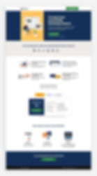
01. Wix.com
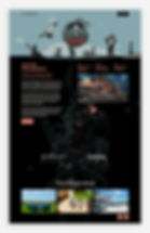
We’ll start off with something a little familiar. This Wix landing page is one of many used to draw in potential clients who are looking to start their online journey. The first fold includes all the essential elements you’d expect to find when creating a landing page: the company logo, a straightforward and descriptive headline, one consistent message, engaging and appropriate visuals, and a prominent CTA.
Let’s take an in-depth look into some of these elements.
What you can learn from Wix’s landing page:
Include a prominent CTA: Including a strong CTA is one of the most important landing page best practices. Don’t be afraid to be direct with the wording and bold with the colors. The message Start Now is clear and conveys a slight sense of urgency, while the blue color pops against the light orange background. Here are a few more tips for creating CTAs that convert:
Keep it short, only about two to four words.
Use action-oriented verbs, like ‘Get’ and ‘Subscribe.’
Incorporate a subtle hint of persuasion and urgency.
Use language that matches your brand identity.
Be as direct as possible. Users should know exactly what to expect after they have clicked on your CTA.
Use engaging visuals: Wix has beautified their landing page with a captivating and evocative digital illustration that continues throughout the length of the page. The top fold features a mountain whose peak points directly to the CTA, drawing visitors’ eyes straight to the button.
The mountain imagery relates to the idea of reaching new heights, perhaps by creating a website. The image (or images) you choose to display should quickly and effectively reflect the purpose of your product or service.
Minimize the scroll: All of your poignant information should appear ‘above the fold’ (the part of the website that’s viewable on the screen before visitors have to scroll down). This content should greet your visitor from the second that they click on your link.
In this example, the logo, headline, CTA and visuals are all available to the viewer above the fold. If your landing page requires more information, and therefore more space, you can use directional visual cues like arrows to invite them to scroll down. In this case, the water motif is what encourages visitors to keep scrolling, tying together the various elements of the landing page.

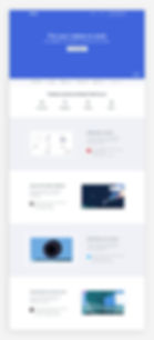
02. Udemy for Business
Udemy is a global marketplace for online courses of all shapes and sizes. From data science to graphic design and social media marketing, there are thousands of programs available for learning and teaching online. By enabling people to study from the comfort of their own homes, Udemy strives to help individuals enhance their skills and realize their visions.
While users are able to individually sign up for courses, this particular landing page promotes Udemy’s business plan. It offers companies a platform through which they can train and educate their employees, providing them with extra capabilities and knowledge on a range of topics. This can help businesses support their employees while working remotely and empower them to keep developing their careers.
Utilizing clear text, alongside a professional-looking headshot to set the tone, Udemy instantly explains what their solution for businesses is all about. The content above the fold is light and airy, compared to the rest of the page that has a more dynamic design to make sure that visitors stay engaged while scrolling.
What you can learn from Udemy’s landing page:
Create an engaging experience: The background ensures that each fold looks slightly different, crafting a compelling scrolling experience. At the same time, Udemy has made sure to keep the overall aesthetic consistent, sticking to their brand colors and a defined layout. The incorporation of images, video and testimonials that appear in a slideshow format keep visitors drawn to the screen.

03. Milanote
This visual organization platform offers an easy-to-navigate LP as their main website’s homepage. A clean, white background allows the product description and CTA to stand out, while a colorful, collaborative product example is placed on the right side. The example shows various tools and features that display the product’s capabilities in a fun, engaging way.
As visitors scroll through, several product examples show off the product’s range and diversity. Bright colors provide an appealing experience, and user reviews back up the company’s claims.
What you can learn from Milanote’s landing page:
Show off your product’s full range of capabilities: Your target audience will be more likely to convert if they’re more knowledgeable of the tool you're trying to sell them. This doesn’t mean you need to provide text with every single detail. Appealing, creative imagery can be far more effective.

04. Deliveroo
Founded in the UK, food delivery company Deliveroo now operates in many cities worldwide. While their central website targets customers making food deliveries, this landing page is aimed at restaurants that are looking to partner with Deliveroo.
It’s clear that the company has pinpointed the needs of their target market and has defined the overriding aim of their landing page. This helps to make a distinction between their main website and this one. Every bit of copy and design decision has been tailored to fit their goal.
Instead of photos of luscious salads and fresh-out-the-oven quiches seen on their general website, the overall design of this landing page is much more business-oriented. The video at the top focuses on restaurants and deliveries, rather than the customers. There’s also a short, explanatory sentence to instantly highlight what restaurants can gain from partnering with Deliveroo. A simple statistic helps strengthen this message.
What you can learn from Deliveroo’s landing page:
Utilize online forms: A common element in landing pages, online forms can help companies gather important information about customers. However, if they’re too long or complicated, customers are likely to get put off. In this case, Deliveroo has included only the most crucial details and has made it easy to fill in the form, thanks to convenient drop-down lists and clear labeling.
Include a privacy policy: If your form asks for sensitive information, you should reassure your visitors that their information is safe by highlighting your privacy policy. That way, they will be more inclined to oblige. Deliveroo has added a link to their privacy policy directly below the ‘Submit’ button, making it extra visible for their site visitors.

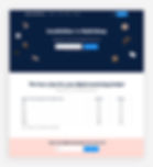
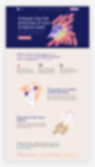
05. Epicurrence
This event website by Epicurrence promotes their four-day conference for creatives. Merging adventure sports and activities with intimate, interactive discussions, this one-of-a-kind event is perfectly captured in this unique landing page example.
The design merges the elements of a classic landing page with intriguing copy, atmospheric illustrations and seemingly handmade dioramas that give a hint as to the event itself. A few bold, well-chosen words set the tone on the top fold. The CTA stays put as you scroll down the site, inviting visitors to buy a ticket without being too forceful.
Browsing the website almost feels more like being cosily wrapped up listening to a story around a campfire, than scrolling down what is ultimately a marketing asset. Thanks to the delicate text and dreamy illustrations, the overall experience is engaging, inviting visitors to linger a little bit longer.
06. ExpressVPN
ExpressVPN has cleverly crafted a landing page nearly identical to their website. The difference? They’ve removed the menu bar from the top of the page, leaving the primary CTA, Get ExpressVPN, and the language option in the upper right corner. This way, the only action that remains is to purchase the product or close the page.
A large illustration containing an image of two people holding their smartphones on a vacant mountain conveys the message that ExpressVPN can be used from anywhere. The warm tones match the rest of the brand colors and the smiling faces of the characters relay a friendly demeanor that infers an easy going company culture.
What you can learn from ExpressVPN’s landing page:
Optimize for mobile: Your landing page should be optimized for mobile - there’s just no two ways about it. In fact, considering the amount of people who use mobile devices, the mobile version of your landing page may even garner more traffic than your desktop version. This LP is perfectly optimized for mobile, with fixed CTAs that follow the reader as they navigate through the site.

07. Dropbox Paper
Mainly known for their file hosting service, Dropbox offers a number of additional tools and features. This landing page example promotes Dropbox Paper, a collaborative workspace for teams of all sizes. Aiming to provide a platform for remote teams to work together effectively, the platform includes brainstorming tools, a tool to help facilitate more effective meetings, and more.
Dropbox has utilized the wonders of visual hierarchy throughout their landing page, particularly in the top fold. Consisting of just a few words, this section perfectly captures the essence of their product. Thanks to the use of large text, site visitors’ attention is instantly drawn to this content, helping them understand what the product is all about. Smaller sized microcopy elaborates more on the product, while an animation helps clarify the message.
Further down the site, a very clean and spacious design is paired with explanatory text and videos, plus clearly defined buttons and a fixed menu that ensures you can easily sign up at any point. They have also included testimonials by various teams and companies, clearly showing visitors how their teams can gain from using the platform. By using the word stories instead of testimonials, the tone is more eye-level, making the references feel valuable and credible.
What you can learn from Dropbox’s landing page:
Incorporate whitespace: Whitespace is a design term referring to the amount of space between the various elements. Regardless of the objective of your landing page, it needs to be aesthetically pleasing.
Adding whitespace to your website layout is crucial, as it allows your content to breathe, while ensuring that your visitors will not feel inundated with information. Dropbox achieves this by crafting a spacious design and adding slideshows that help disperse the content.

08. Blue Apron
Planning and preparing three meals a day can be a challenge, especially when your daily routine is filled to the brim with other tasks and activities. Enter: Blue Apron. This home delivery service enables you to select a weekly menu for you and your family. Then, a delivery of fresh ingredients and recipes is dropped off straight at your door. This solution helps you save time and minimize food wastage.
This landing page targets first time users of Blue Apron as they aim to hook in new leads with an appealing introductory offer. Their logo, headline and CTA can be found front and center on the first fold. Plus, all their information is surrounded by delicious looking, high quality food photography.
As you explore further, an explanation of how their service works is shown through a timeline of images and text. That’s followed by all the reasons why you should try Blue Apron and customer reviews - all very convincing.
It’s important to note that their CTA remains consistent throughout their page. It appears several times, ensuring that when a visitor is convinced and has made the decision to claim their offer, they won’t need to scroll too much to click on that all-important CTA.
What you can learn from Blue Apron’s landing page:
Keep your messaging clear: Taking into account short attention spans is important when designing any kind of website. When it comes to landing pages, it’s especially vital to hook visitors within a couple of seconds. In order to convert website visitors into customers, your message has to be crystal clear. Blue Apron has mastered their website copy, making it simple but not simplified. Their text is friendly, understandable and easily skimmable - perfect for today’s average internet browser.

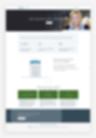
09. Vimeo for Business
Vimeo is a video hosting site created by a group of filmmakers catering to professional videographers. The company provides creators with tools and technology to host, distribute and monetize videos. They offer various plans according to different functions users may need ranging from basic to premium plans.
This landing page is specifically targeted towards users who need video solutions for their business. It’s no surprise that each function is shown through the use of video, alongside a short description and testimonial for each. The platform’s mission statement is bold and clear, followed by a straightforward CTA: Get Vimeo Business.
What you can learn from Vimeo’s landing page:
Know your audience: Since landing pages are not a one-size-fits-all operation, it’s important to understand your audience when writing website content. The tone and messaging of the text throughout Vimeo for Business is heavily tailored to big companies. This is seen through the headline: More engagement, more collaboration, and more growth for your business. They’ve understood what businesses want to achieve and have clearly laid it out.
Eliminate all other navigation: Your landing page should have a clear goal: to convert visitors into leads. Therefore, you should remove all links that could potentially deter visitors. There’s no need to include a website menu leading to multiple pages. Vimeo only includes one consistent CTA throughout the page to reiterate the same message: Get Vimeo Business.
10. Spotify for Podcasters
Audio streaming platform Spotify has created a landing page for their podcast hosting services. While their main website focuses on a broad message - “Listening is everything” - this landing page specifically targets podcasters looking for a platform through which to share their content.
The stark color contrast puts the focus on the written content, which clearly states the purpose of the page and highlights the platform’s main benefit for podcasters. There’s a distinct color palette that differentiates this page from Spotify’s app, using blue hues instead of its signature green. This helps indicate to visitors that this landing page serves a different purpose.
The page walks you through Spotify’s using digital illustrations and digestible, down-to-earth copy. This winning combination helps reflect a vibe that is both approachable and professional.
Lastly, they’ve added inspirational content in the form of testimonials by other podcasters, and insider tips on how to start a podcast, book interviews for your show and more. To seal everything off, the landing page ends with an FAQ section, showing users that the brand is there to answer all of their questions and queries.
What you can learn from Spotify’s landing page:
Include a prominent FAQ section: Doing so allows potential customers to more fully understand the product or service you’re trying to sell them. It also shows that your company cares to provide clarity both about the user experience and the product or service itself.

11. Acts of Random Kindness (ARK)
Dedicated to spreading acts of random kindness, ARK hosts an annual event every December in which people are invited to show up and help put smiles on the faces of others in their community.
This heartwarming mission is successfully conveyed in their landing page. Accurately reflecting their values and messaging are the heart-shaped cursor and adorable animated vector art at the top of the site. There’s also the option of changing the display to dark mode, enabling site visitors to adjust the design according to their preferences.
As you scroll, the menu at the top stays put, inviting you to click Give at any point during your browse. Another nice touch is the text at the bottom of the page that has a friendly, welcoming feel to it, as does the microcopy on the button, Yes! Let’s do this!
What you can learn from ARK’s landing page:
Add in social sharing: When you include social sharing buttons on your landing page, your visitors can help you further spread your message on their own profiles. On top of that, include links to your business’s social media profiles. ARK includes links to their social accounts in their landing page’s footer, as well as an invitation for site visitors to share a Tweet or Facebook post to promote their message and initiative.

12. Uber for Business
Since the ridesharing business started out in 2009, the brand has expanded from peer-to-peer sharing to private rides, food delivery services and even a bicycle-sharing system.
A more recent chapter in their development is Uber for Business. This solution gives businesses the ability to schedule pickups for their clients, guests or customers. These rides can be requested on the spot or scheduled ahead of time. All you need in order to arrange the ride is your guest’s name, their phone number and destination. Unlike you, as the user, your guest does not need the app in order to catch their ride.
Although the landing page for Uber for Business looks slightly different from other Uber pages, it is still highly recognizable as part of the Uber brand. The first fold of the page includes the crux of what’s on offer as well as a Get started for free CTA that repeats in other areas of the page. As you scroll, more information is revealed in greater detail.
What you can learn from Uber’s landing page:
Keep your text short: Your visitors are flooded with information. This is why most internet users have fallen into a habit of skim reading. In order to combat this, keep your text concise and sweet, just like Uber has. While they present a lot of information, it’s spaced out, sentences are kept succinct with one to two lines each and photos are used to reinforce the messages.
Follow the F-pattern: Another method used to catch those skim readers is something called the ‘F pattern.’ The key here is to grab viewers’ attention to areas where their eyes naturally gravitate towards. This was developed due to the extensive research done on eye-tracking.
Here’s how it works:
Imagine someone mapped out the letter ‘F’ on your landing page. Whatever areas are included along its lines are the places where you will want to insert all of the most important information and phrases in your writing.
The horizontal lines of the F-Pattern are areas where you can place headers that quickly explain to the reader what they can expect to find on your page. Uber achieves this by placing ‘Uber for Business’ in the top left corner. After that, your eye is drawn to the CTA, followed by the next chunk of text starting on the left: ‘Working together to help move what matters.’
After scanning across the top horizontal section of your page, a reader will naturally gravitate to the vertical line running downwards on the left-hand side. Your job will be to fill this space with interesting features that jump off the page. This encourages readers to follow the remainder of the sentence. It’s best to use bulleted lists, quote pulls or featured images in order to break up your content a bit. Uber follows this by repeating their CTA on the left-hand side. Designed in white with black text, the CTA stands out against the dark background.
It’s important to note that while this specific LP follows an F-pattern, most landing pages follow a Z-pattern. This is due to the fact that LPs are usually low on text and high on elements like buttons, forms and short explanations. You can also find these patterns applied in many of Wix’s designer-made landing page website templates, that you can fully customize to your needs.
Here’s how to formulate a landing page using a Z-pattern:
The idea is that someone could roughly draw the letter ‘Z’ onto your page, starting from the upper left-hand corner and ending at the bottom right-hand corner, and hit every stage of the flow you’ve created for your web visitors.
The top of your ‘Z’ (the left hand corner) is where your readers’ eyes will naturally gravitate towards, making it the perfect place to add your logo.
The diagonal part (the angled line) that runs across the page from the top right-hand corner to the bottom left-hand corner is meant to swiftly carry visitors from the top panel to the next section you want them to focus on. Whatever you place here should immediately grab attention. In the case of your landing page, this is where you could include your offer, powerful copy, images, video or form.
Moving from there to the tail end of the letter this is your spot to grab those visitors that you have managed to hook. Finish it off with a compelling CTA. This can be an invitation to sign up to a newsletter, request a demo, buy your product or book an appointment.

13. Sendinblue
Sendinblue is an all-inclusive digital marketing platform that specializes in email marketing. The company helps businesses connect more easily with their customers and provides tools to help them grow in a scalable, sustainable way.
This landing page takes a competitive approach that directly compares Sendinblue’s services to its prime competitor, Mailchimp. The first thing you see on the page are the words Sendinblue vs Mailchimp with an impossible-to-miss sign up box. Businesses can quickly input their email address and be well on their way to improve their digital marketing efforts.
As you scroll down, tables comparing Sendinblue’s tools and services to Mailchimp’s are presented front and center to showcase where Sendinblue has the advantage. Even the testimonials towards the bottom compare the two companies, providing real world examples of how customers have benefited from this company over others.
What you can learn from Sendinblue’s landing page:
Use competition to your advantage: By comparing your product to another, you provide direct differences between your products, highlighting why yours is superior. This is a smart way to sell and provides potential customers evidence as to why they should choose your product over others.
14. LinkedIn Business Solutions
LinkedIn is the social media platform specifically tailored for professionals and businesses to network. It can be used to create company pages, as well as individual accounts. Users can showcase their business skills, accomplishments, launches, employees and so much more.
Since it’s a platform with many users and activity, it’s also become a spot where advertising space has proven to be valuable and successful. This landing page is targeted at businesses looking to reach new clients by advertising on LinkedIn.
The first fold includes the LinkedIn logo we all know but with a more tailored name, ‘Business Solutions,’ an uncomplicated headline and not one, but two CTAs calling for the same action - creating an ad. Then, the landing page goes straight into why you need to use LinkedIn ads, along with some impressive stats.
They have opted for a fixed menu (meaning that the menu remains in the same place as you scroll), which includes their logo and CTA. This way, no matter where you are on their page, the call-to-action is always accessible.
What you can learn from LinkedIn’s landing page:
Keep it focused: The more to-the-point your page is, the better. Your landing page should have one single purpose. Here, the message is to promote LinkedIn Ads. Apply the same principle for your own landing pages: take a look at your business plan and define your goal for a particular landing page, making sure to keep it consistent throughout. Avoid any visual clutter and put the focus on your main prize: that coveted CTA (shown here with the use of a frozen menu).
Give order to your information: LinkedIn has successfully considered the thought process of their visitors. First, they start with a powerful headline, followed by a CTA inviting users to create an ad. Then, as if preempting that a user may have some questions, they present a list of reasons why you should choose them. Following this, they go into more detail about their features, using short text and images of the actual interface, plus three clear steps to get started. After all that valuable and convincing content, they end off their landing page with a secondary CTA to seal the deal.
15. Hootsuite
Social media management tools have by now become integral parts of marketing strategies. Hootsuite enables you to improve your social media marketing by letting you manage and schedule all of your content in one place.
Through illustrated screenshots and on-point copy, their landing page playfully explains exactly what they offer. The page merges the fun and digestible vibe of social media with a professional approach. Hootsuite’s included reviews by trusted customers as a way to build credibility with new users. Each fold of the page is used to explain and detail the multitude of features available.
What you can learn from Hootsuite’s landing page:
Emphasize your first fold: Your top fold is by far the most important element of your landing page (alongside your CTA). It’s the first thing visitors will see and it may be the determining factor of whether they decide to stay or leave. Hootsuite hits the nail on the head with this one. It’s clear, bold and to-the-point. Users immediately understand what it is they are offering and how they can benefit from it. For optimal impact, we recommend keeping your first fold to 11 words or less.
Repeat your CTA: Since your CTA is the gateway to converting clients, make sure it’s available to them throughout your page. Hootsuite does just this by placing their CTA in multiple spots: their static navigation menu, the top fold of their landing page and in the package picker.
16. Wondrium
The name Wondrium perfectly describes this online education site that provides a wide array of courses. The combination of wonder and emporium conveys a space where visitors can linger for as long as they desire and gain new knowledge.
This landing page uses different colored and patterned backgrounds that strategically coordinate and match the brand, providing harmonious flow to the page. On the first fold, visitors will see a backdrop of course cover photos with a large, orange CTA along with the tagline Let your mind go here. The combination of an intriguing tagline and a prominent CTA helps channel people’s curiosity and peaks their interest in the offer.
As visitors continue to scroll, they’ll see a prominent FAQ section against a navy blue background, which is perfectly in keeping with the tone of a company aimed at providing information.
What you can learn from Wondrium’s landing page:
Keep your landing page on brand: This could be through your logo, slogan, business name or any other element that will help your audience recognize you - regardless of how they landed on your page. A big part of building a brand is reiteration, so use your landing page as another opportunity to show more of your business and unify your brand voice.

17. Spatium
Different shades of purple and captivating images of outer space make it difficult not to install this Google Chrome extension on your computer. An abundance of white space accentuates the limited text, creating an attractive and straightforward design. Spatium’s logo, a small circle connected to two half semi circles, is placed in the upper left corner with the name of the product. While the logo is small, your eye is drawn to it due to the empty space around it.
The bottom fold of the page includes images with a brief description of what the extension offers, each followed by the CTA, +Add to Chrome. This provides visitors multiple opportunities to easily take advantage of the offer.

18. Moderne
Digital workspace Moderne provides creative teams with tailored ideas, references and insights for their advertisements and campaigns. Acting as an all-in-one toolkit, the idea is to help teams optimize their marketing efforts, collaborate effectively and save valuable time on research.
Everything about the design of this landing page indicates that it’s aimed at creative professionals, from the illustrations to the typography choices. The custom illustrations are colorful and expressive, very different to the precise vector illustrations that are often used by digital brands. Instead of sticking to a restricted color palette, Moderne has chosen a broad spectrum of shades that also enhances the sense of freedom and creativity.
These unconventional touches are what help Moderne deliver their message of creativity and collaboration. Despite this unique design, they’ve still stuck to the classic elements of a landing page: a powerful header, multiple CTAs and content that has been split up into digestible sections.
19. Airbnb
Since its launch back in 2008, Airbnb has been offering homestays, lodging and other forms of tourism experiences across the globe.
The company’s main website has various sections pertaining to different users, whether they want to become a host or book a stay. Here, this specific landing page is targeting businesses who want to use their services for when they need accommodation, co-working spaces or team building exercises while traveling.
The first fold is filled with a large video background showing various scenarios of colleagues traveling, working and mingling. A clear headline in stark white describes the notion that Airbnb wishes to portray. In order to get started, visitors simply have to input their email and press Continue. To maximize conversion opportunities, the same CTA repeats at the bottom of the page.
If you scroll down, the page is filled with more pictures and descriptions of all the work-oriented options and accommodations. These are also accompanied by tailored CTAs: ‘Explore work-ready places to stay.’ In order to add a sense of credibility, there’s a dedicated testimonial section.
What you can learn from Airbnb’s landing page:
A video background: Since Airbnb has numerous options, locations and services, a video is a smart way to show it all off at once. It’s important that the visual language remains the same throughout your page. The company achieves this by using only video and images that complement each other in terms of lighting, atmosphere and look-and-feel.
20. Unsanforized by 3sixteen
Fashion brand 3sixteen produces clothing and accessories, priding themselves in their use of premium materials and quality American manufacturing. First and foremost a denim brand, they have created this minisite to present their unique approach to denim and to highlight the story of their most cherished product - the jeans.
It may not be a typical landing page example, as it’s more eCommerce oriented, but it certainly serves to promote their brand and ends with a CTA leading you to their online store. The story-like structure walks you through the steps of how to soak their jeans before wearing them for the first time, emphasizing why unsanforized denim is the way to go.
The large product photos and minimalistic layout convey professionalism and quality. Together with the text, the overall experience is engaging and convincing without being too pushy.
What you can learn from Unsanforized’s landing page:
Think outside the box: Following LP guidelines and best practices works, but sometimes it can be worth designing a landing page that truly stands out. Creating a unique, eye-catching website entices customers to spend more time on the page, potentially leading them to follow through on your CTA.

21. Skillshare
This landing page design includes a navy blue background with pops of white and lime green. The contrast between dark and light colors on an extremely short page focuses the attention on the primary objective, to sign up for Skillshare. Besides a regular signup form, the page also provides multiple other ways to do so, including via Facebook, Gmail and Apple.
What you can learn from Skillshare’s landing page:
Provide multiple ways to sign up for an offer: Many people have their login information for Facebook and email autosaved on their computer. When you offer signup options through these platforms, it makes it easier to register because it means there is less typing involved. In a world where people are flooded by marketing, any shortcuts you can offer will increase the chances of users signing up for your product.

Best practices for creating effective landing pages
Whether you’re using a landing page template or are building your website from scratch, it’s imperative to keep these best practices in mind when you create your own landing page.
Here are some landing page best practices to take away from these examples:
Give your CTA the spotlight
Use engaging visuals
Minimize the scroll
Know your audience
Eliminate extensive navigation
Create an engaging experience
Make sure your page is mobile-friendly
Incorporate whitespace
Present an enticing offer
Keep your messaging clear
Keep your text short
Emphasize your header
Test your landing pages for better conversions
Once you’ve mastered the recipe of landing page creation, don’t stop just yet. There’s always room for improvement that could bring you extra leads. While there are ways to use your landing page wisely, there’s no magic formula that is guaranteed to work for everyone. It takes time to perfect the art and find what resonates with your audience.
There are many factors that could influence the success of your page, including timing, exposure, text, images and more. A good way to understand what’s working and what’s not is to run A/B tests. This refers to the method of comparing two versions of the same piece of content, with one item changed in order to create the variation.
When performing an A/B test on your LP, It’s important that you only change one element to really understand what is causing the success or detriment of your page.
Options for elements that you can tweak include:
Shorter or longer text
More direct or urgent messaging
The colors of your background or text
The image selection
A still image vs. a video
The size of your CTA
The placement of your CTA
The general layout of your page
Your offering

By Talia Cohen
Small Business Expert and Marketing blogger

By Taira Sabo
Wix Blog Writer
